Title Screen
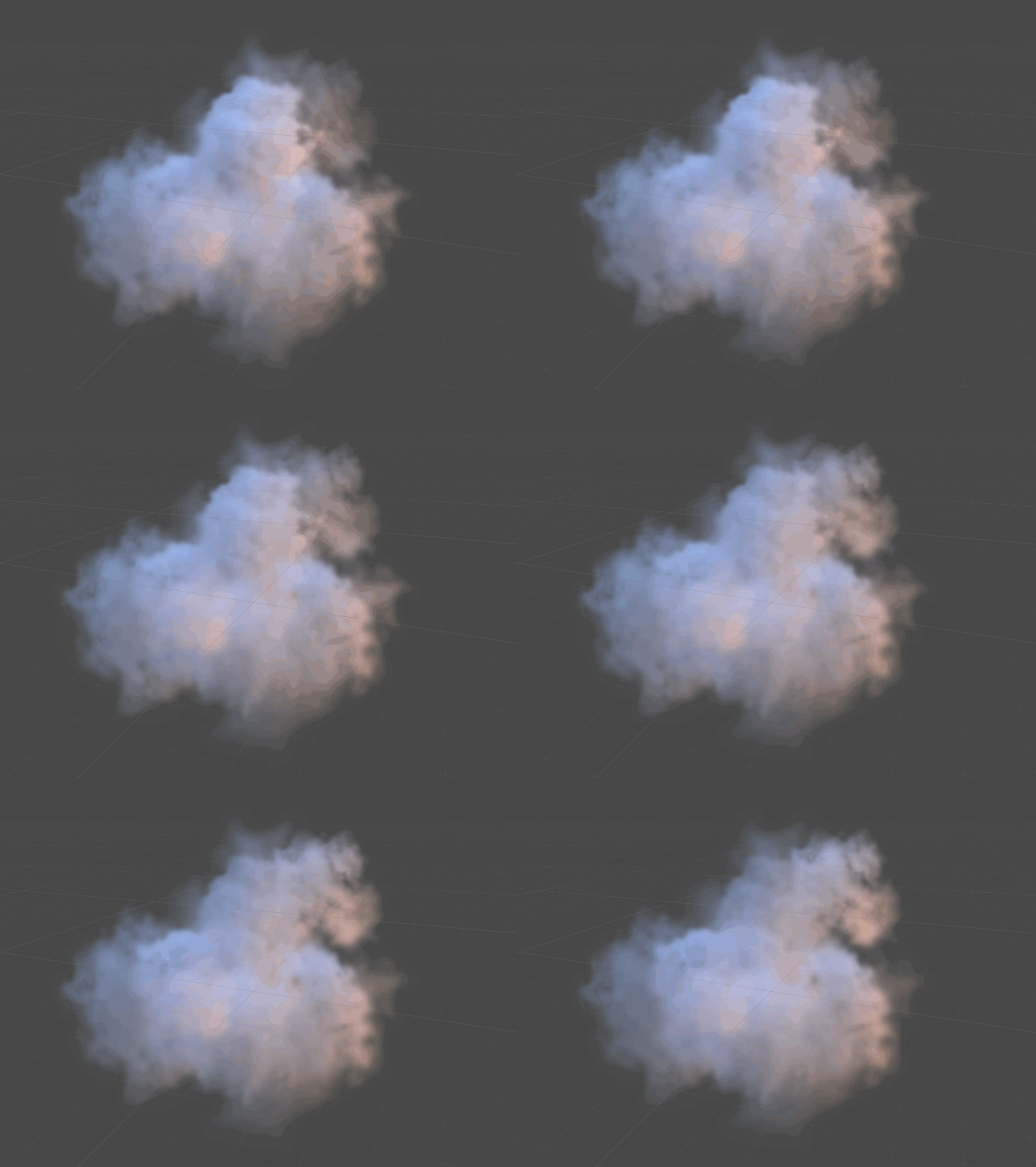
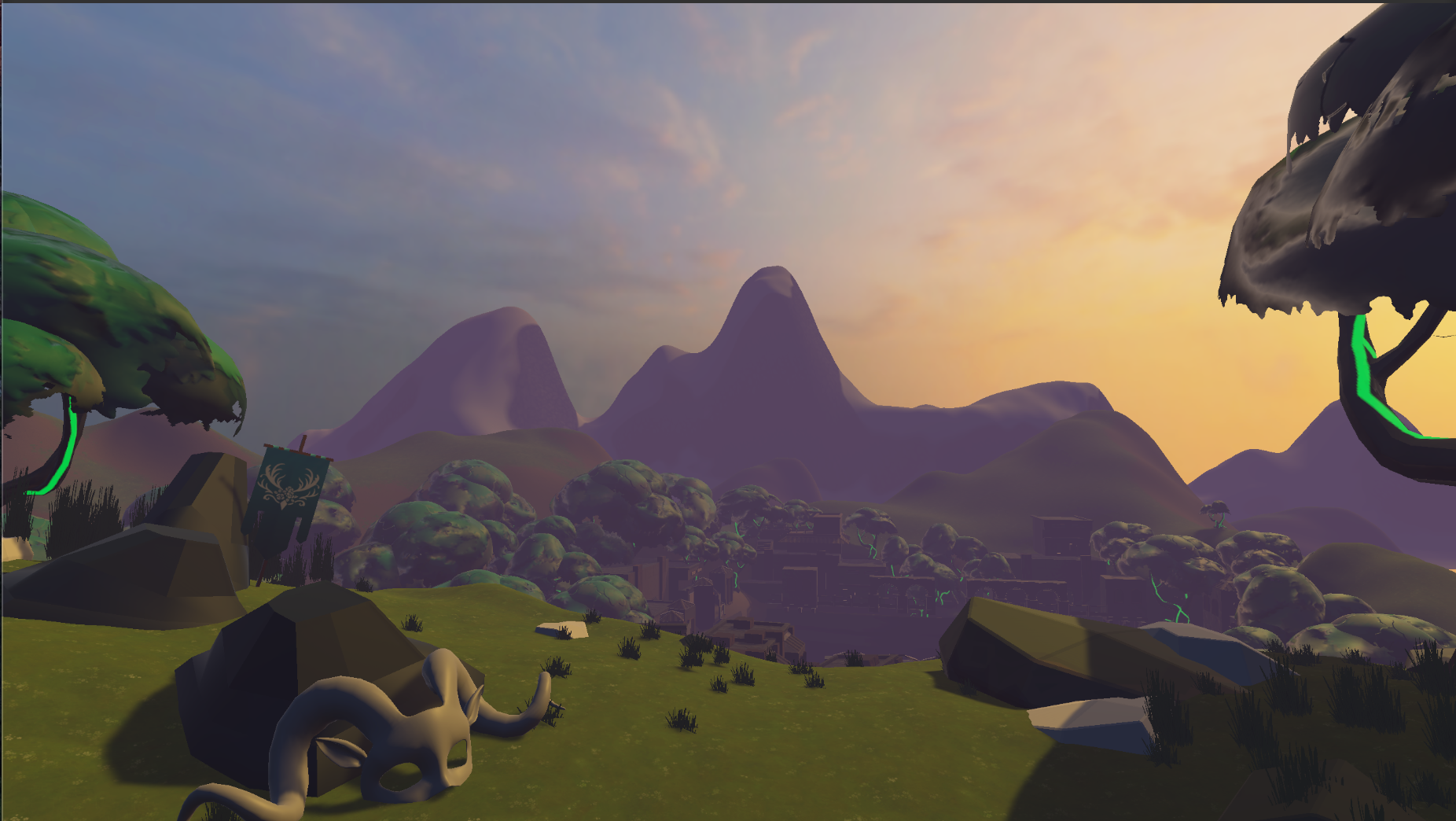
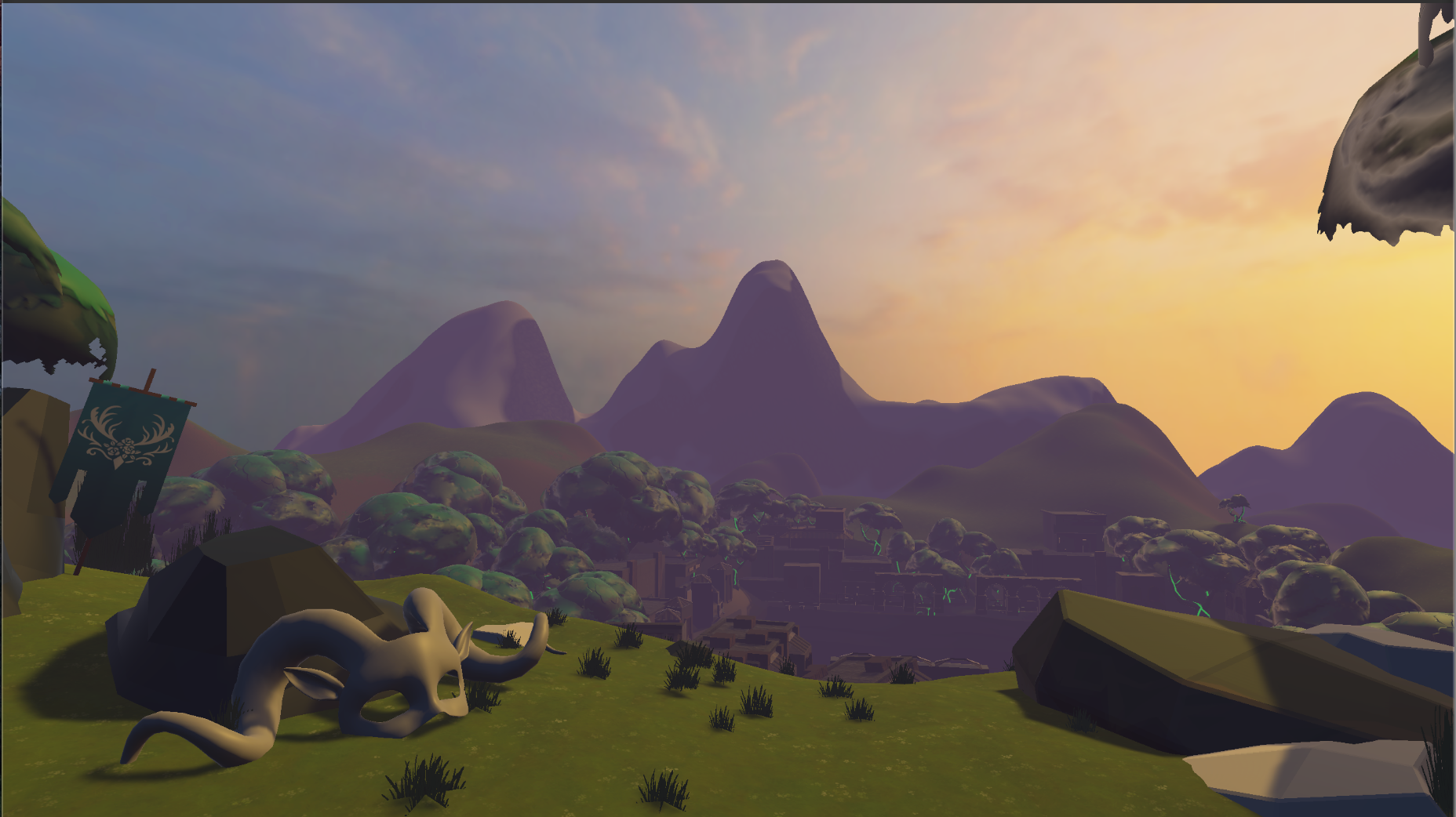
More progress on the title screen this week. It’s a learning process but it’s coming along nicely. This week I removed the 3-light setup I had and started working with a new skybox, color palette and lighting fog. At Gillian’s recommendation during the art meeting, I changed the fog from orange to purple to resemble “the mountains in Colorado” during dusk. Best advise all week. With that simple change, the range of colors in the scene has grown tremendously. To keep the scene from feeling too static, I added some velocity to my cloud particles and I added in Cole’s legendary grass shader!
More progress on the title screen this week. It’s a learning process but it’s coming along nicely. This week I removed the 3-light setup I had and started working with a new skybox, color palette and lighting fog. At Gillian’s recommendation during the art meeting, I changed the fog from orange to purple to resemble “the mountains in Colorado” during dusk. Best advise all week. With that simple change, the range of colors in the scene has grown tremendously. To keep the scene from feeling too static, I added some velocity to my cloud particles and I added in Cole’s legendary grass shader!
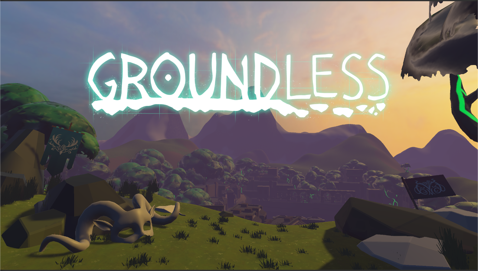
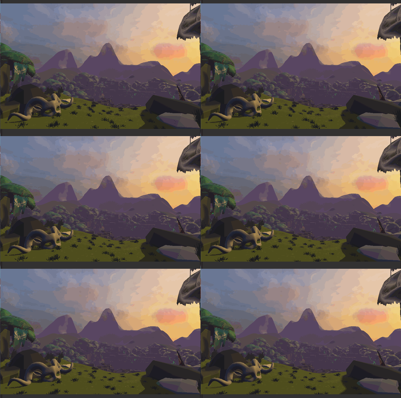
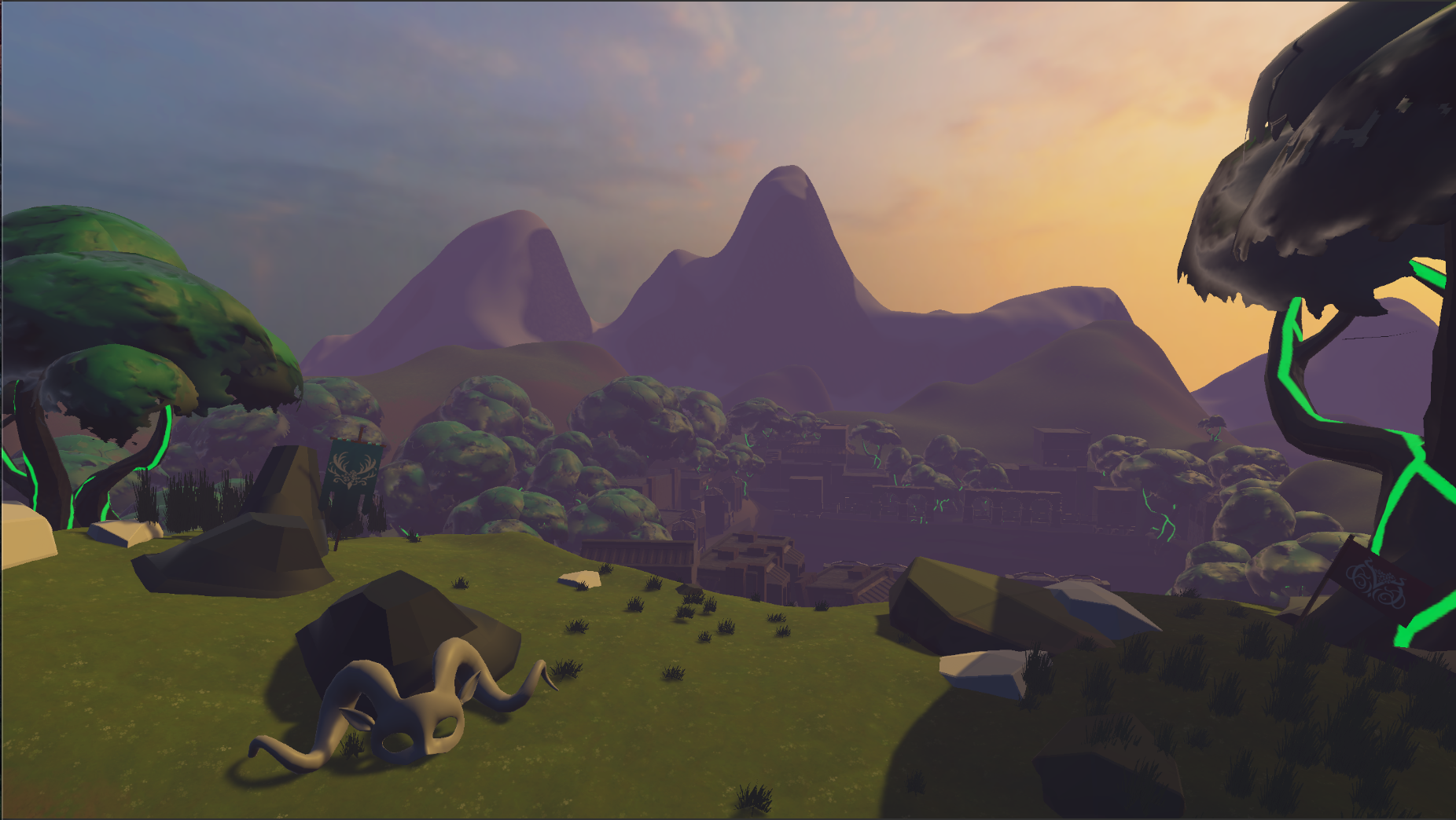
The final edit I made to the scene was change the camera’s view. Last week it was too far out and showed too much of the cliff in the foreground. This extra room left me with too much space to populate with assets, and as a result made it feel dull. By zooming in the camera and having it tilted up a bit, it provides a better view of the mask and helps focus the scene more on the distant view of the Outgrove and the Abyss.
More Holograms
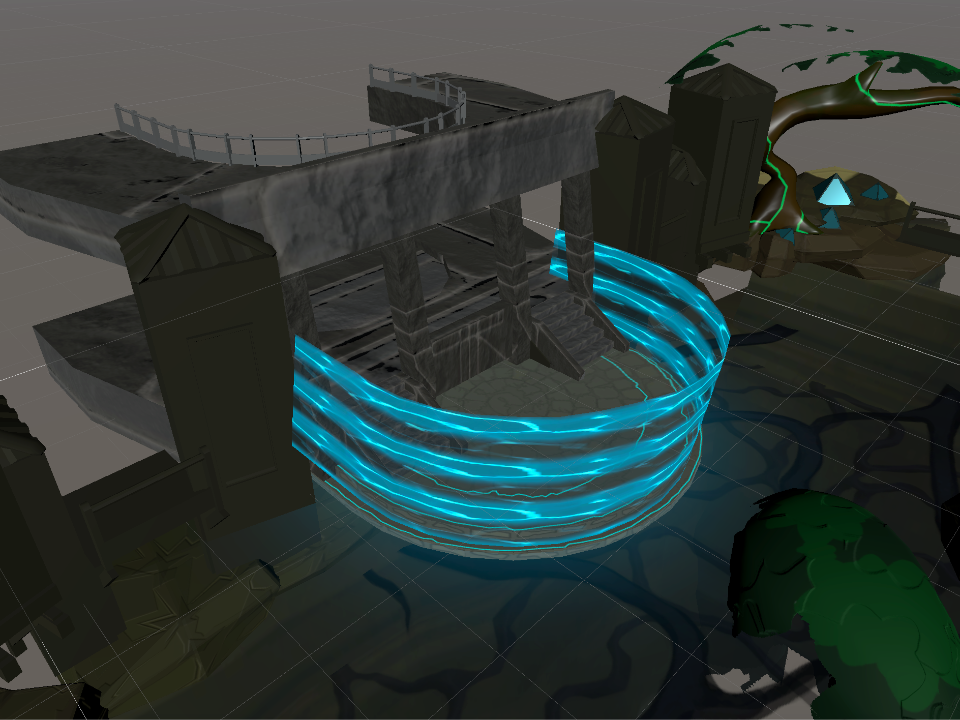
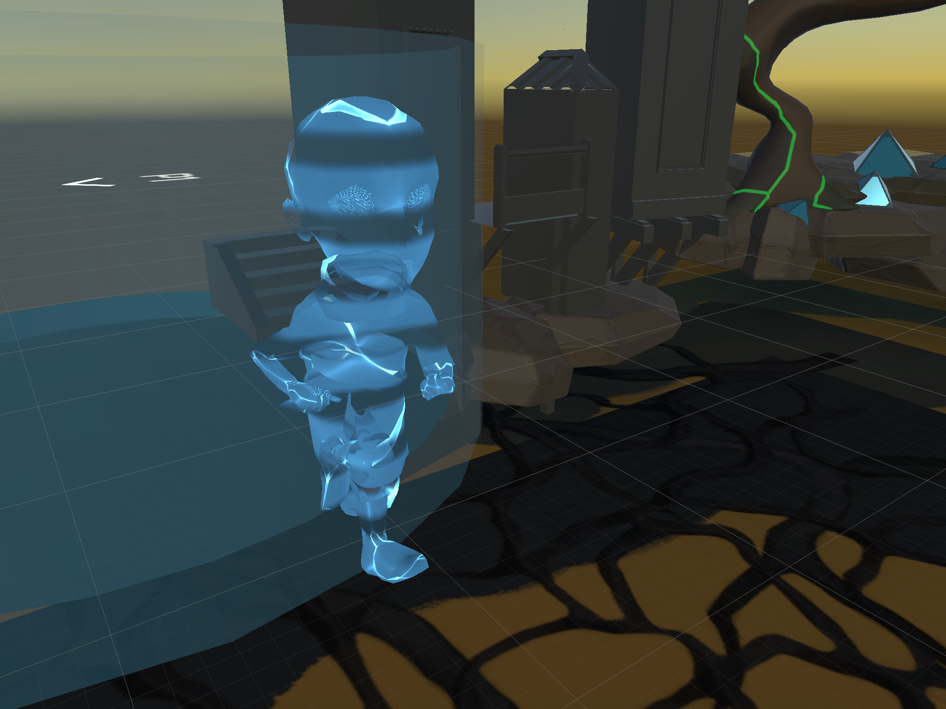
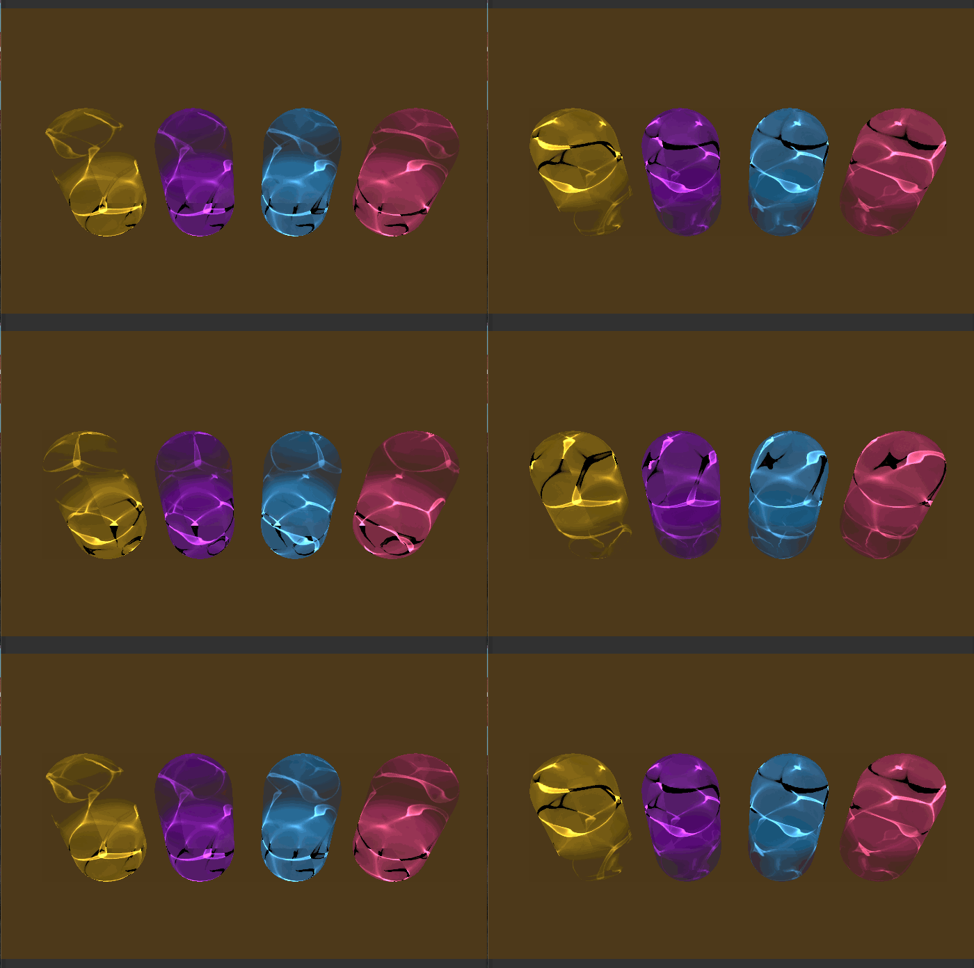
In addition to playing with the title screen, I also took a bit of time to create the two additional hologram effects for the 3rd and 4th player colors. These will be implemented into the new game modes within the coming weeks.
In addition to playing with the title screen, I also took a bit of time to create the two additional hologram effects for the 3rd and 4th player colors. These will be implemented into the new game modes within the coming weeks.
Hours (14.5hrs)
Title Screen (10hrs)
Holograms (0.5hrs)
Presentation (2hrs)
Meetings (2hrs)
Title Screen (10hrs)
Holograms (0.5hrs)
Presentation (2hrs)
Meetings (2hrs)

