GDC
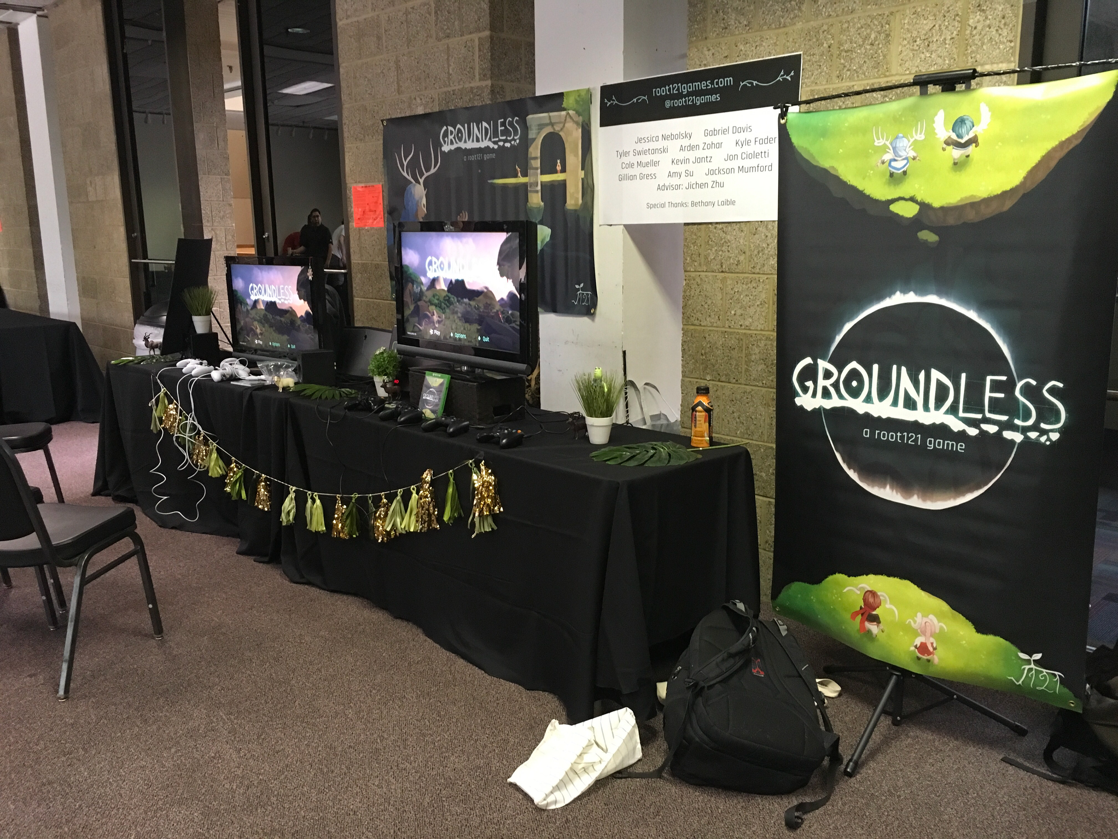
With finals out of the way, a portion of the team had the opportunity to travel out to San Francisco to attend GDC. It was an amazing experience out West with a few members from the team, and I hope we get the chance to go next year! My favorite part was having the chance to play a game at a booth and speak with the developers on why they made the choices they did, and how I could continue to work towards my own goals as a technical artist.
With finals out of the way, a portion of the team had the opportunity to travel out to San Francisco to attend GDC. It was an amazing experience out West with a few members from the team, and I hope we get the chance to go next year! My favorite part was having the chance to play a game at a booth and speak with the developers on why they made the choices they did, and how I could continue to work towards my own goals as a technical artist.
In addition to talking to devs, a few of us got to attend the Intel University Games Showcase to support Split Side Games’ game Fling to the Finish. They presented just as well, if not better, than they did back in January. It was fun to watch and I am super proud of them for winning 1st place for design and 3rd place in art!
Spawn Zones
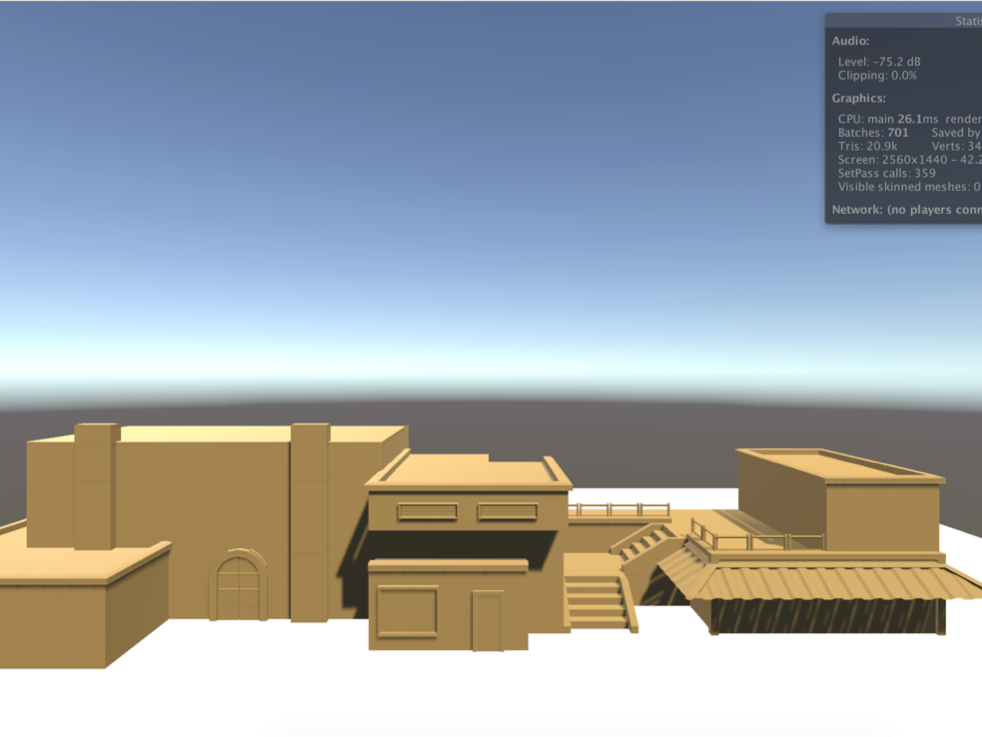
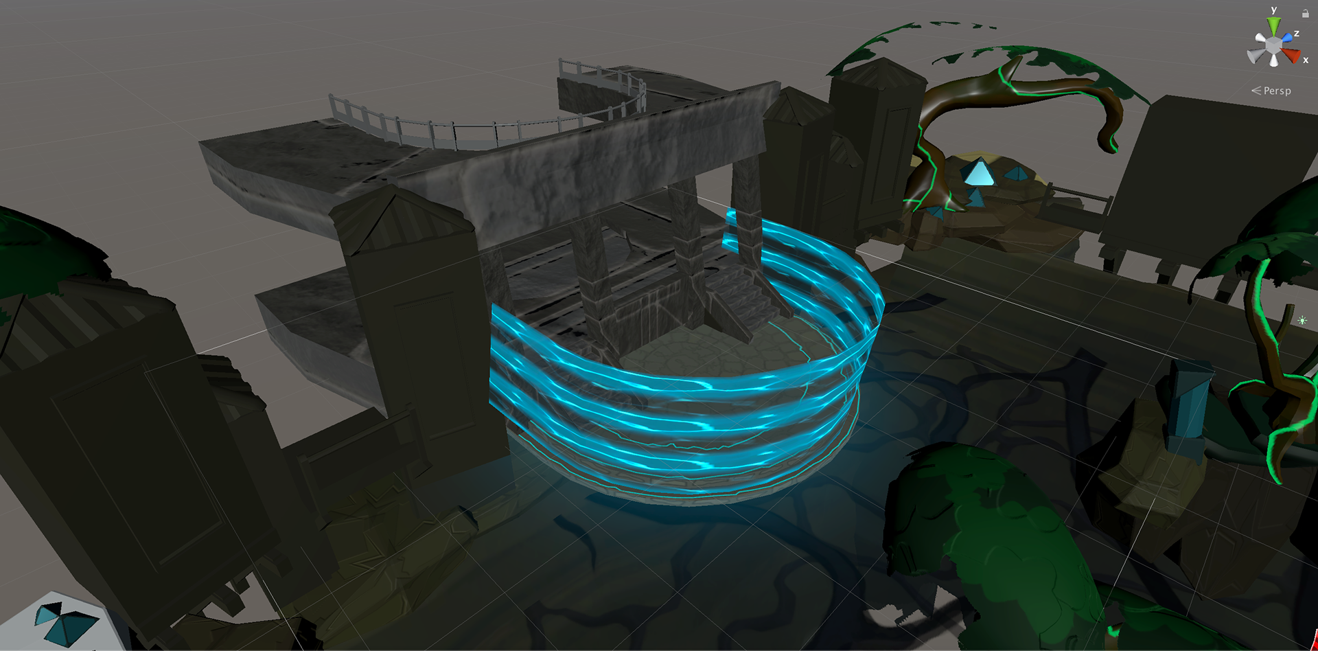
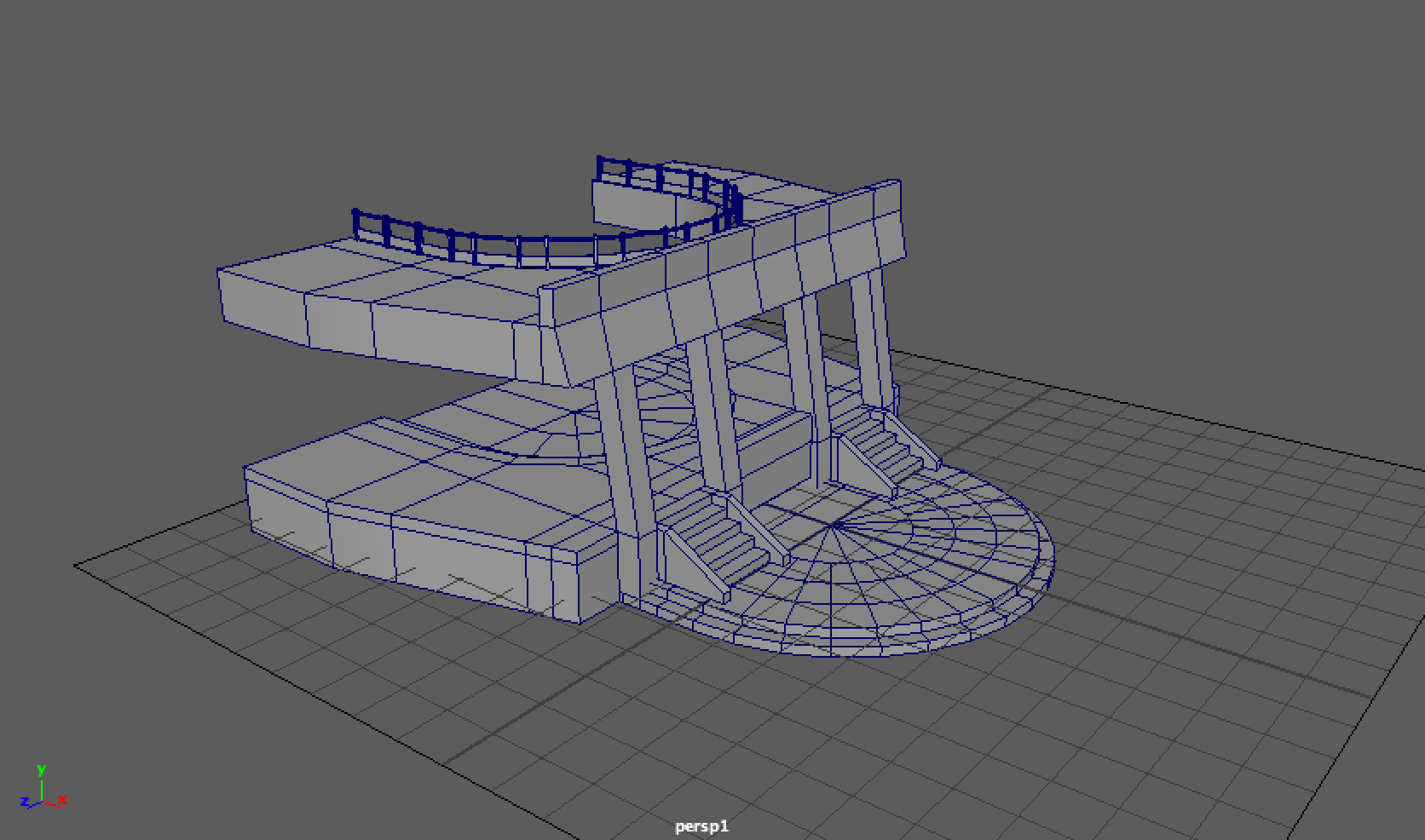
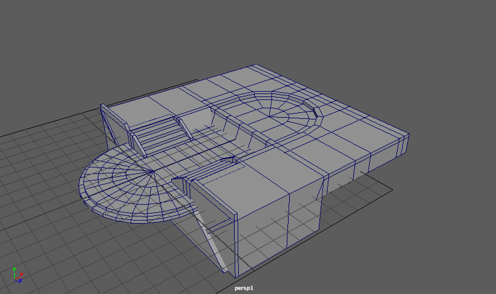
We FINALLY have new spawn zones that aren’t big red and blue circle! This actually happened before GDC. After weeks of the task not being assigned to anyone, I took it upon myself to just start working on it. I told Gabe I would model the spawn platform, the structures behind them and even create the one-way wall around it. The first thing I modeled was the spawn platform itself. I didn't go too in depth with concepts and just started modeling it based on the current placeholder model. I kept the circular front, but had the rest of the platform extend backwards into the potential structure. I added some dimension with a small step down into the game space. My ultimate goal with the step was to let the build casts fill over it, and also have it act as a shelf that could hold the one-way wall. Once modeled, I UVed it, and sent to to Kevin for texturing. I told him to keep the blocks big because if this platform were was holding itself over a pit, it should be solid.
We FINALLY have new spawn zones that aren’t big red and blue circle! This actually happened before GDC. After weeks of the task not being assigned to anyone, I took it upon myself to just start working on it. I told Gabe I would model the spawn platform, the structures behind them and even create the one-way wall around it. The first thing I modeled was the spawn platform itself. I didn't go too in depth with concepts and just started modeling it based on the current placeholder model. I kept the circular front, but had the rest of the platform extend backwards into the potential structure. I added some dimension with a small step down into the game space. My ultimate goal with the step was to let the build casts fill over it, and also have it act as a shelf that could hold the one-way wall. Once modeled, I UVed it, and sent to to Kevin for texturing. I told him to keep the blocks big because if this platform were was holding itself over a pit, it should be solid.
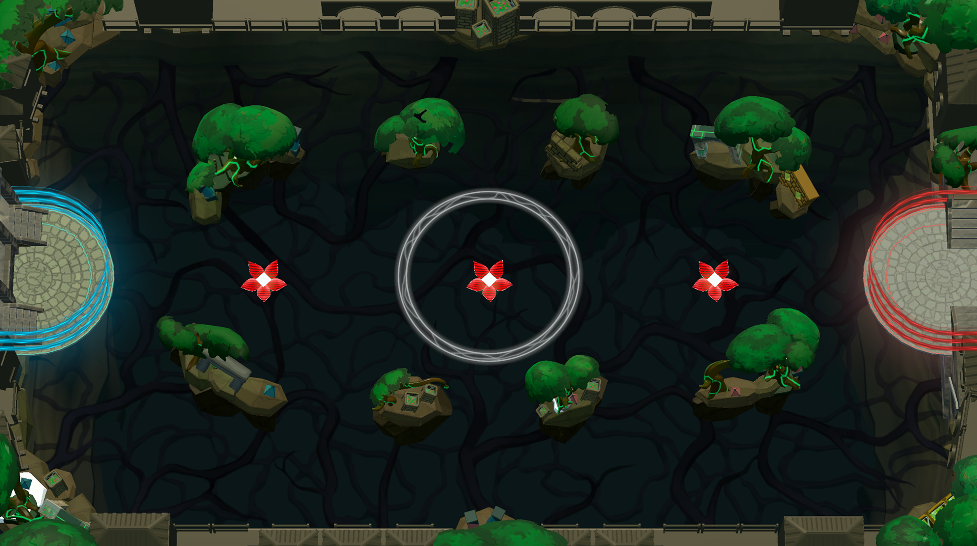
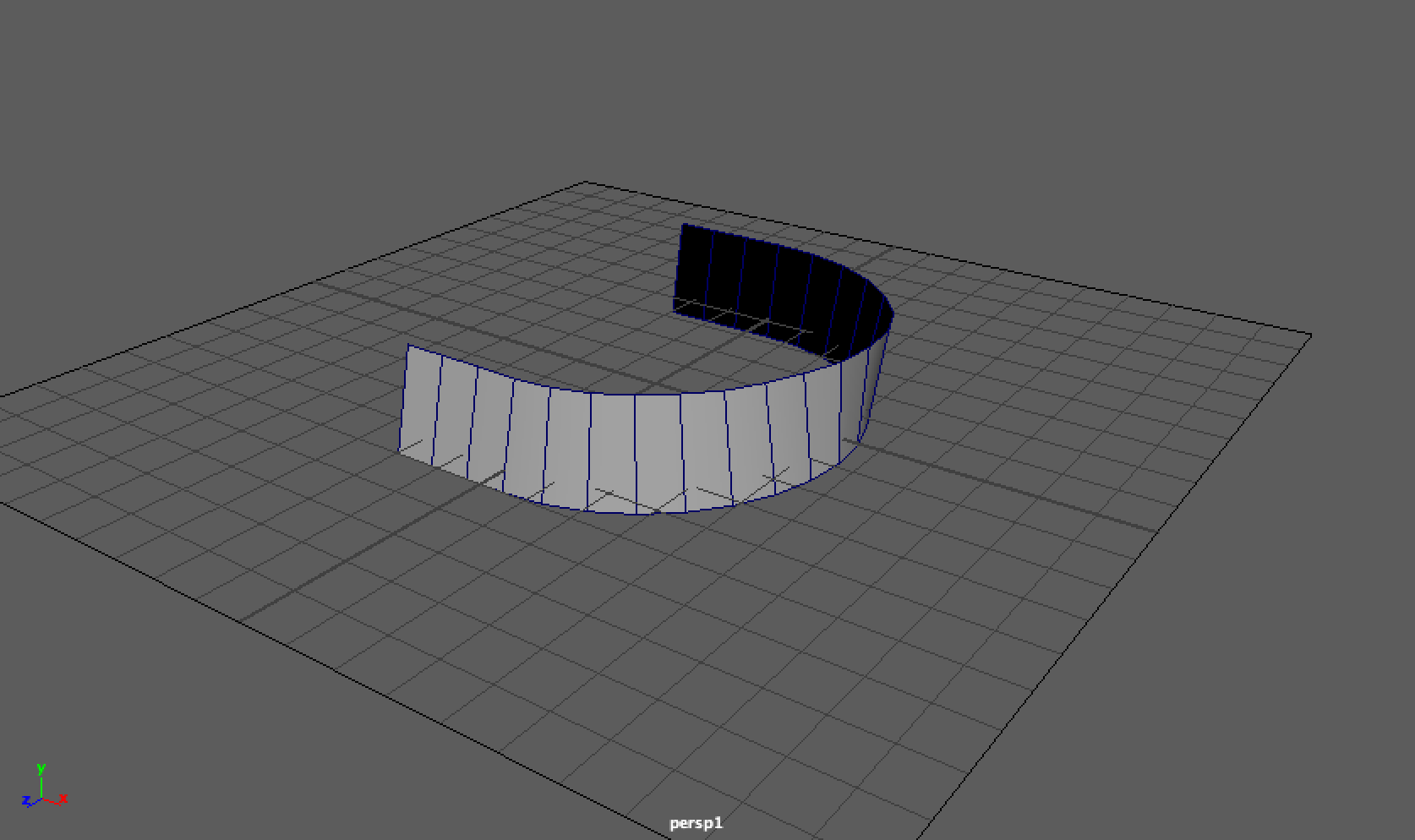
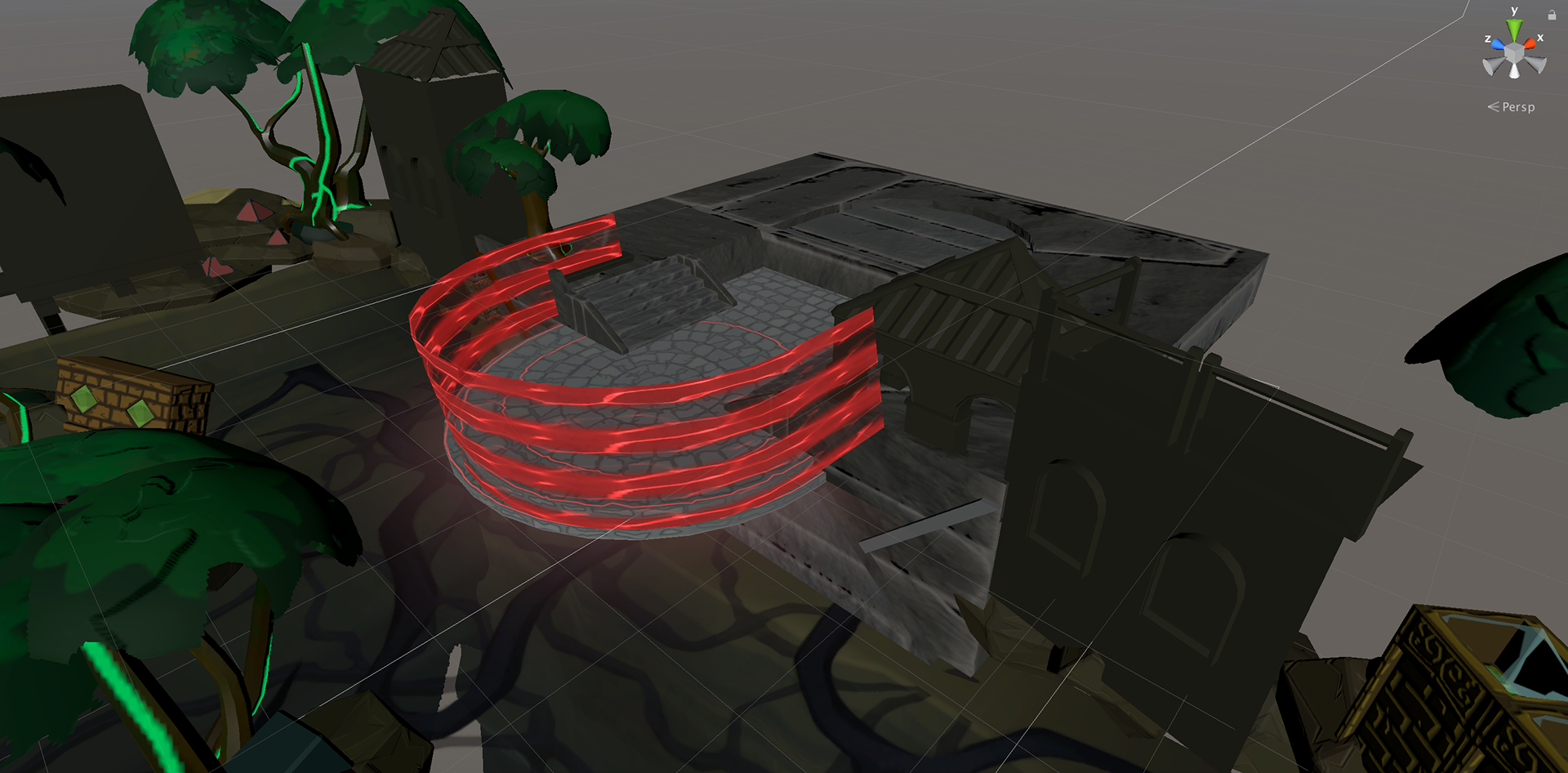
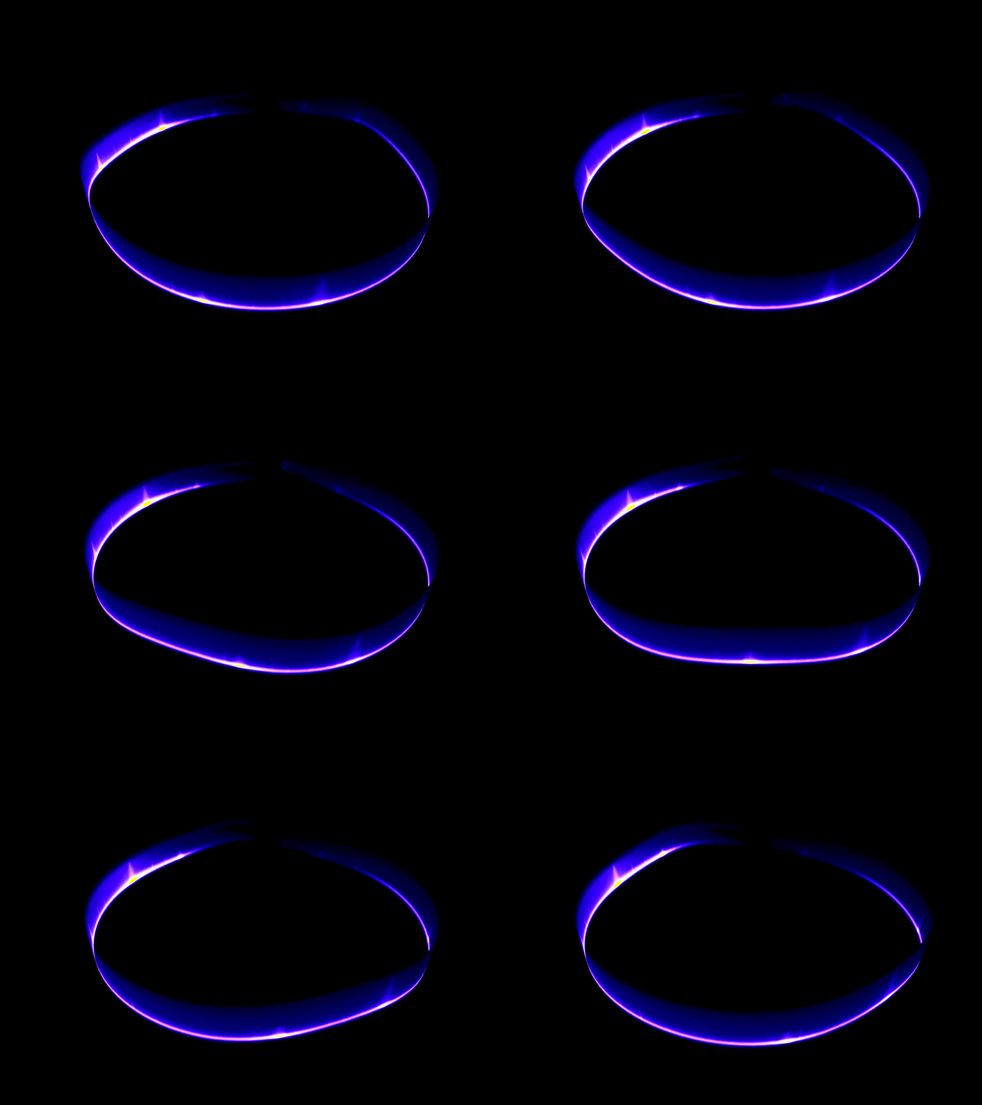
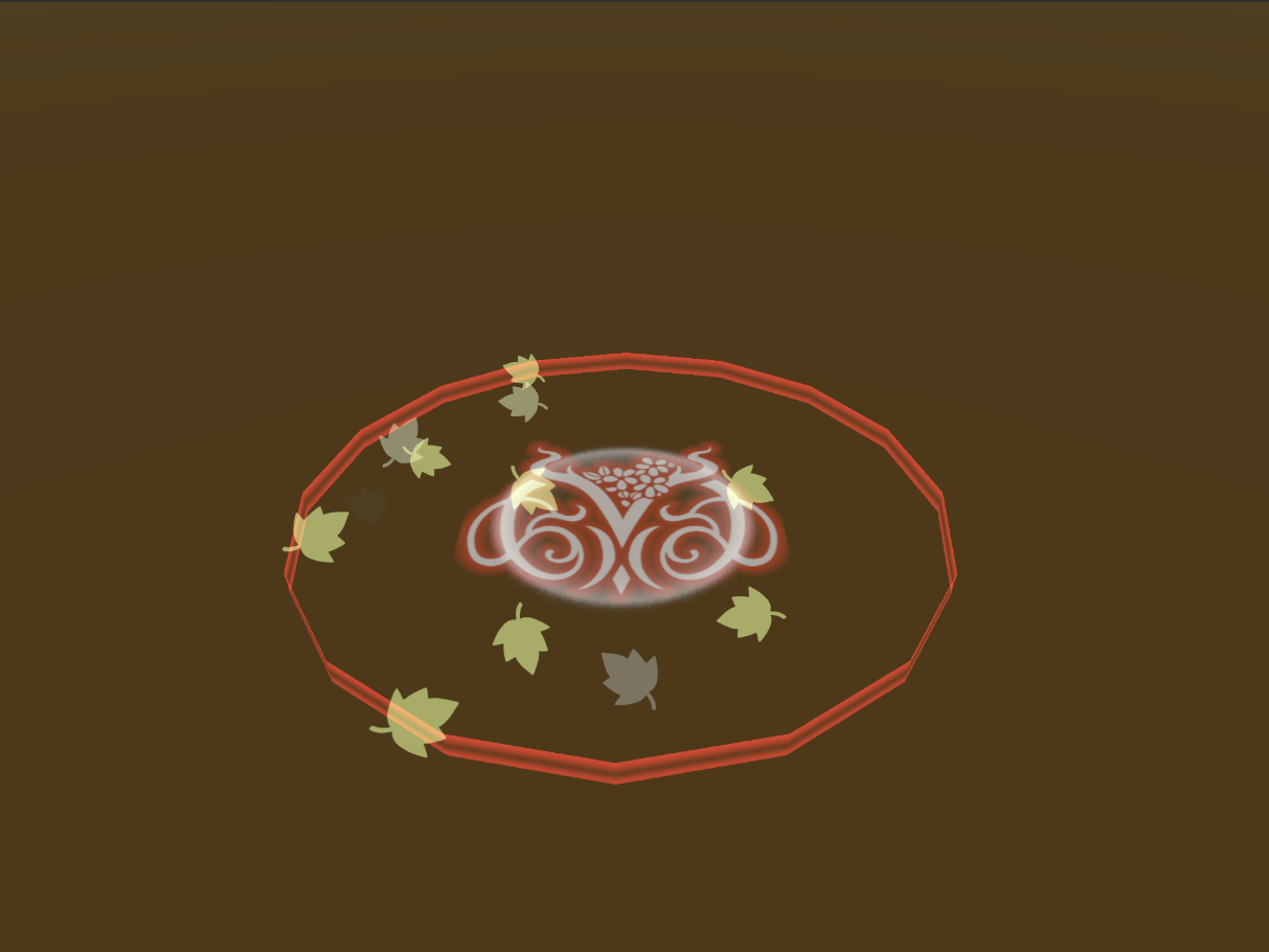
In addition to the modeling of the spawns, I also modeled and implemented the one-way wall. One of the greatest challenges of the wall, was the way it looked in a top down perspective. As a simple cylindrical wall that's one face thick, the camera wasn't able to render specific sections when they were at a certain angle. To combat this, I tried tilting the wall away from the camera at an angle, and even towards to camera too. But in the end a combination of the two was the solution. The bottom half was angled away from the camera, blends into the cylinder that was angled towards the camera, and then back to angled away at the straight end on top. This lets the in game camera see the wall clearer.
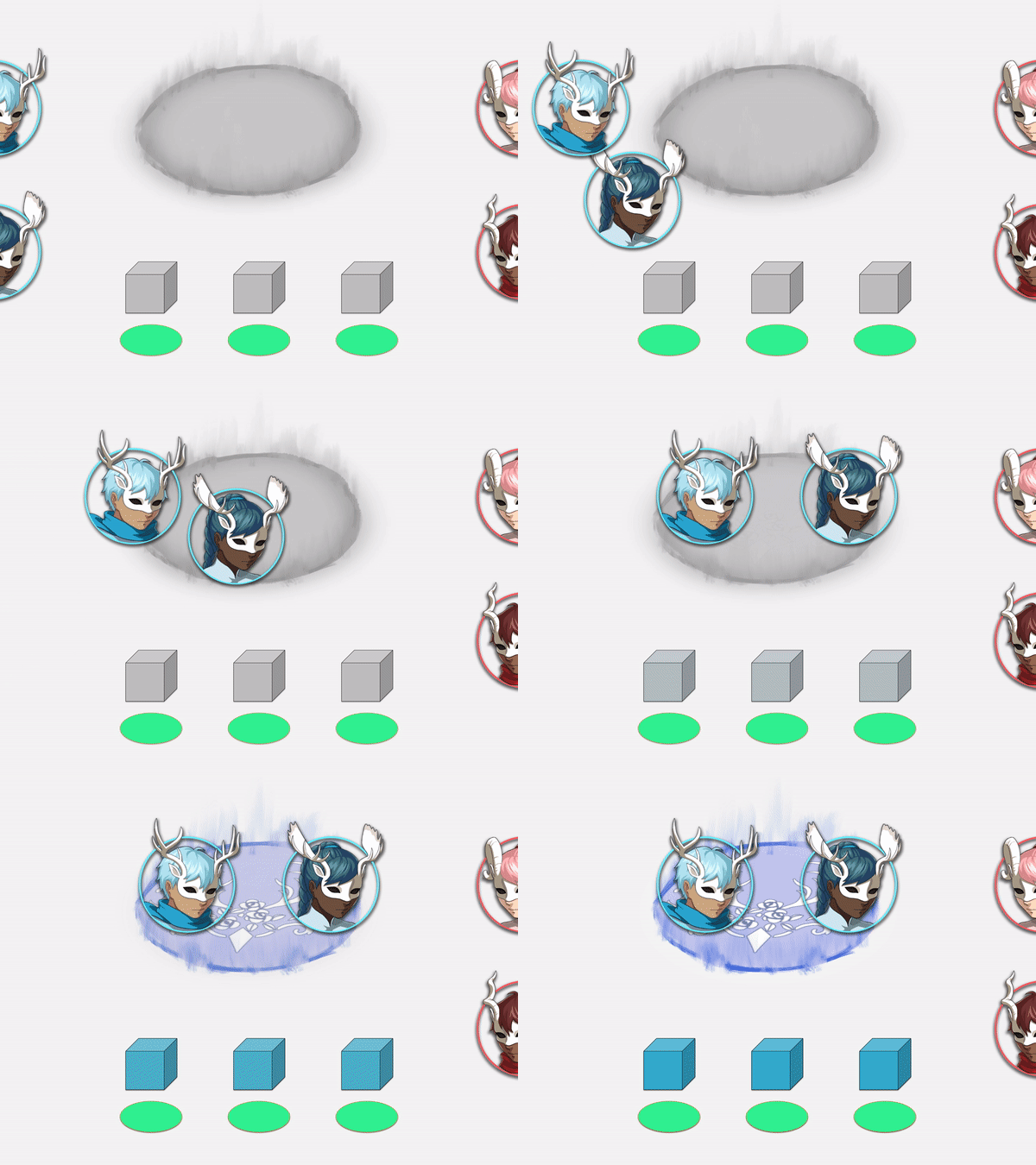
After perfecting the one-way wall's shape, I moved on to implementing it in game. This part wasn't bad. I just needed to replace the current temporary one-way wall we had, and edit the script a bit. For a material I used a modified hologram shader, like the one for the death/revive character. I also got to mess around with the Animation Timeline when having it disappear. Now instead of blinking out of existence, it wipes away like a hologram shield would. An image faking a glow in the team color was also added. It dims a bit when the shield becomes more transparent as the game starts.
What went well
We finally have spawn zones that aren't big blobs of team color, and they look great! I'm glad that it's done with for PAX. Using the Timeline editor was also pretty interesting. I wouldn't mind playing around with that in the future.
We finally have spawn zones that aren't big blobs of team color, and they look great! I'm glad that it's done with for PAX. Using the Timeline editor was also pretty interesting. I wouldn't mind playing around with that in the future.
What could have gone better
I just think planning and communication. These spawns have been put off for too long. I wish I had the time to take up the work earlier in the term. What's important is that it's done now.
I just think planning and communication. These spawns have been put off for too long. I wish I had the time to take up the work earlier in the term. What's important is that it's done now.
Hours(8hrs)
Spawn Zone Models (4hrs)
Timeline Animations (2hrs)
Meetings (2hrs)
Spawn Zone Models (4hrs)
Timeline Animations (2hrs)
Meetings (2hrs)


